Hampton Water Rosé
Make a Splash
Branding, packaging, photography
Problem: What happens when you mix a rock star and wine? You get Hampton Water Rosé. Hampton Water is a creation of Jon Bon Jovi, his son Jesse and the world renown French wine maker Gerard Bertrand. As the company looked to expand, they needed growth in sales which they were finding hard in the competitive sea of pinks and white. Hampton Water also wanted expand out of the typical Rosé market of being a summer time drink and skewing highly in the female demographic.
Solution: In the most basic sense, to just add a pop of color. In a sea of pink and white simply adding the striking blue contrast makes this label design stand out from competition while feeling less feminine, making it more approachable for the male demographic. The simple design creates the feel of a premium product while still visually telling a strong and rich brand story.
Results: An elegant and timeless bottle design that stands out from competitors on shelf. The brand is very own-able to Hampton Water and helps to tell the story of French wine making and the carefree lifestyle of the Hamptons. Sales have skyrocketed since the release of the new label, leading to increased distribution. Hampton Water is now found in almost every state and its production increased from 20,000 bottles to over 250,000 in just one year. The design also went viral with wine publications and design blogs, and even resulted in artists creating fan art of the label.
Exploration
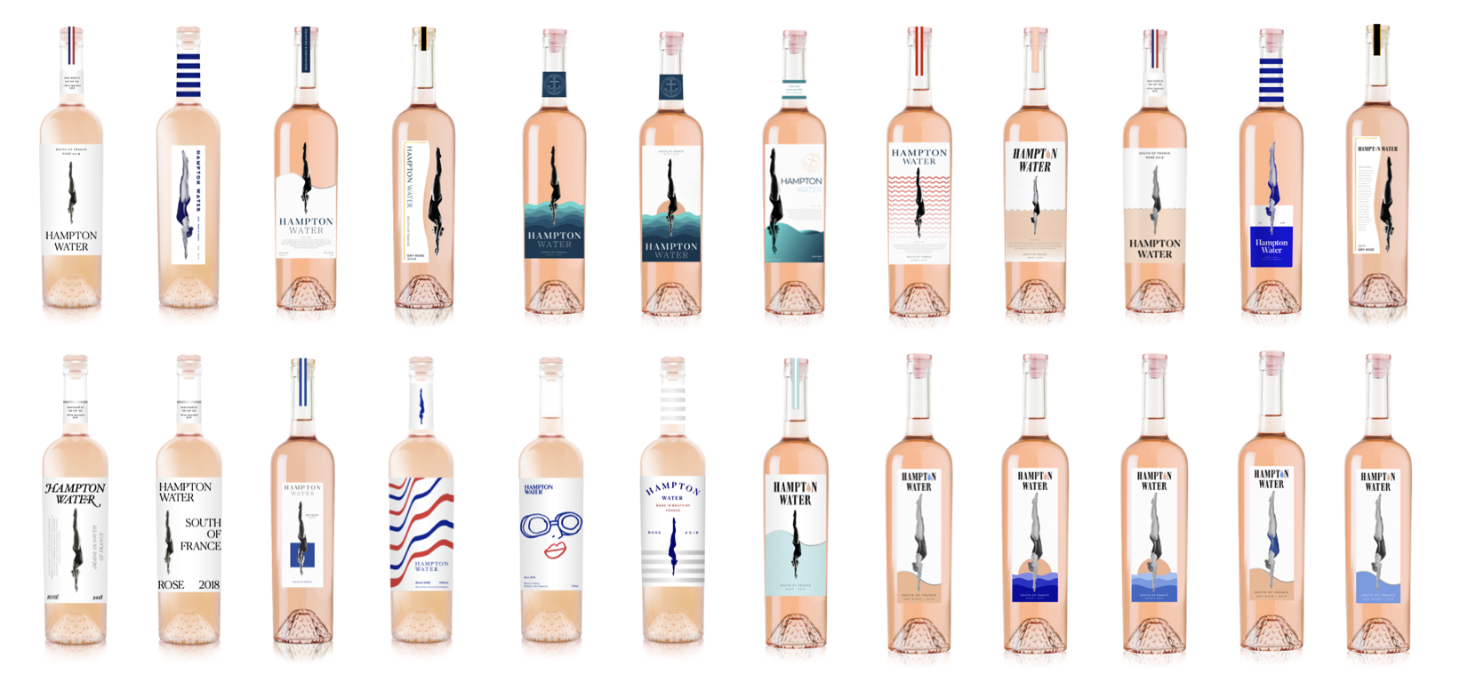
Label Design
Design Concept
The Hampton Water visual essence is grounded in the blend of fun and formal, taking those more sophisticated moments and adding a splash of color and fun to stand out and be truly original.
The Atlantic ocean is what bridges the gap between the Hamptons and France. We wanted to bring the life and movement of the ocean to the label with color and organic waves. It also helps to visually tell the story of French wine quality and the carefree lifestyle of the Hamptons.
The diver is the brand’s most recognizable icon. She is diving in and making a splash wherever she goes. We wanted to give her more contrast to stand out from the rest of the design.
The setting sun is a drop of rosé turned upside down. It adds a layer of depth to the label and is used to highlight elements of interest. It also ties the design back to the product being the rosé salmon color.
The Hampton Water wordmark is a bold and strong claim that helps tie fun and formal together. It speaks to the product itself with the drop of rosé.
The sleek slender label itself compliments the tall bottle and makes it visually feel elongated and more elegant than competitive bottles on the shelf.
Brand
Photography
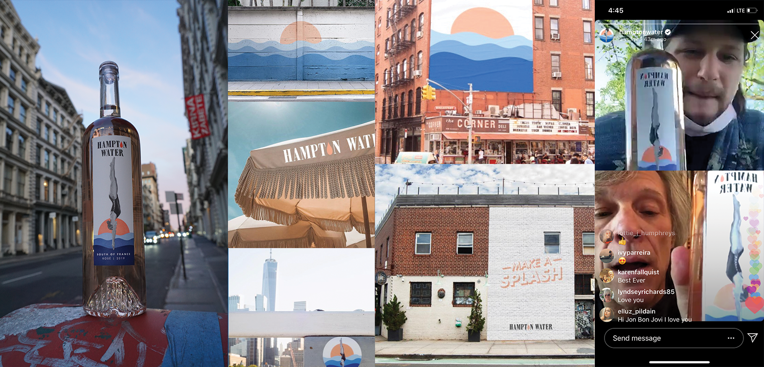
In the Wild
Testing
Visual Saliency Results
Visual Saliency testing utilizes Artificial Intelligence technologies to mimic consumer eye tracking on shelf. As you can see in the graphics to the right the new design stand out against the see of white and pinks in the Rosé aisle. The new label design propelled Hampton Water from the lower 50th percentile and not even in the consumer eye tracking path to the number one brand noticed on shelf.
Label Survey
We also conducted a qualitative label survey inviting 200 Americans in our target demographic to rate our bottle designs. We asked a few questions ranging from overall design, brand messaging and how likely they would pick it up off the shelf. The final label design scored highest across the old design and all the new designs we proposed in all categories. The image to the right shows how our selected label compared to the 4 other highest scoring label designs.


